Even the best artwork won’t look right if it’s placed incorrectly. At Sam’s DTF Transfers, we’ve helped thousands of creators, brands, and print shops get flawless results—and we’ve seen the most common mistakes firsthand. Here’s how to avoid them and ensure your transfers always look professional.
❌ Mistake 1: Placing Designs Too High or Too Low
Problem:
Designs pressed too close to the neckline or hem feel awkward and unbalanced.
Sam’s Tip: For full front designs, place them 2.5–3 inches below the collar seam. Use an alignment tool or folding method to find center and ensure consistency.
❌ Mistake 2: Using One Size Across All Garments
Problem:
A 10" wide design looks great on a medium shirt, but too small on a 3XL and overwhelming on a toddler tee.
Sam’s Tip: Follow our DTF transfer size chart by garment type.
Add +1 inch to full front and back prints on hoodies
Add +0.5 inch to sleeves, pockets, and chest prints for thicker fabrics
❌ Mistake 3: Misalignment
Problem:
Even a slight misplacement can make your design look off-center or unprofessional.
Sam’s Tip: Fold the shirt vertically to find the centerline. Use heat press rulers, laser guides, or our Gang Sheet Builder to align designs precisely before pressing.
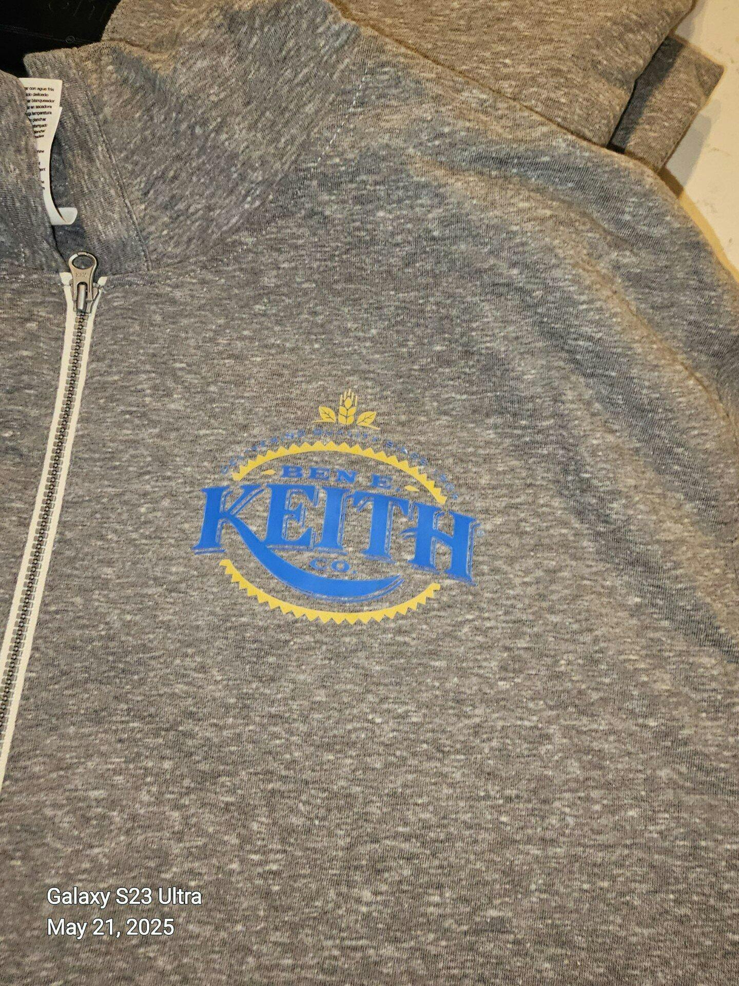
❌ Mistake 4: Pressing Over Seams, Zippers, or Pockets
Problem:
Transfers don’t adhere well over uneven areas and can crack or peel.
Sam’s Tip: Always press onto flat, smooth zones. Shift your design slightly up, down, or sideways to avoid seams, zippers, and pouch lines—especially on hoodies.
❌ Mistake 5: Ignoring Fabric Stretch & Shrinkage
Problem:
Designs placed over stretchy zones (like cuffs or side panels) may warp after washing.
Sam’s Tip: Avoid printing over ribbed collars, cuffs, or elastic zones. For activewear or blends, use firm pressure and make sure fabric is smoothed flat before pressing.